
Who Wore It Worst? The Ugliest Nordic Suits
Olympic years bring out the best…and worst of racing apparel. By Patrick Caldwell
With the Olympics coming up, we need to talk about something: We need to talk about spandex.
Spandex is an undeniably comfortable and stretchy part of the Nordic skier lifestyle. But not all spandex suits were created equal. We all have worn both ugly suits and good-looking ones, which begs the question, which suit was the ugliest?
And so we introduce the Ugly Suit Hall of Fame. To scientifically determine the ugliest suit, we must apply some criteria to determine its Ugly Suit Score (USS).
Category 1: How much did this suit clash? Clashing is a key part of an ugly suit. There will be big points awarded for multiple patterns, mixes of round and angular lines and for colors that God did not intend to be put together.
Category 2: Was this suit “in” for its time? If a suit was relatively cool in its time it will not score well in this category.
Category 3: How well did racers perform in the suit? This is really important. History is full of instances when successful people took uncool things and made them cool. Think of mullets, mustaches, or even shaved heads—all of which are objectively funny-looking and all of which became cooler for having been sported by successful athletes. If a suit was worn by Olympic or World Champions its legend as an Ugly Suit only grows. So, let’s get started.
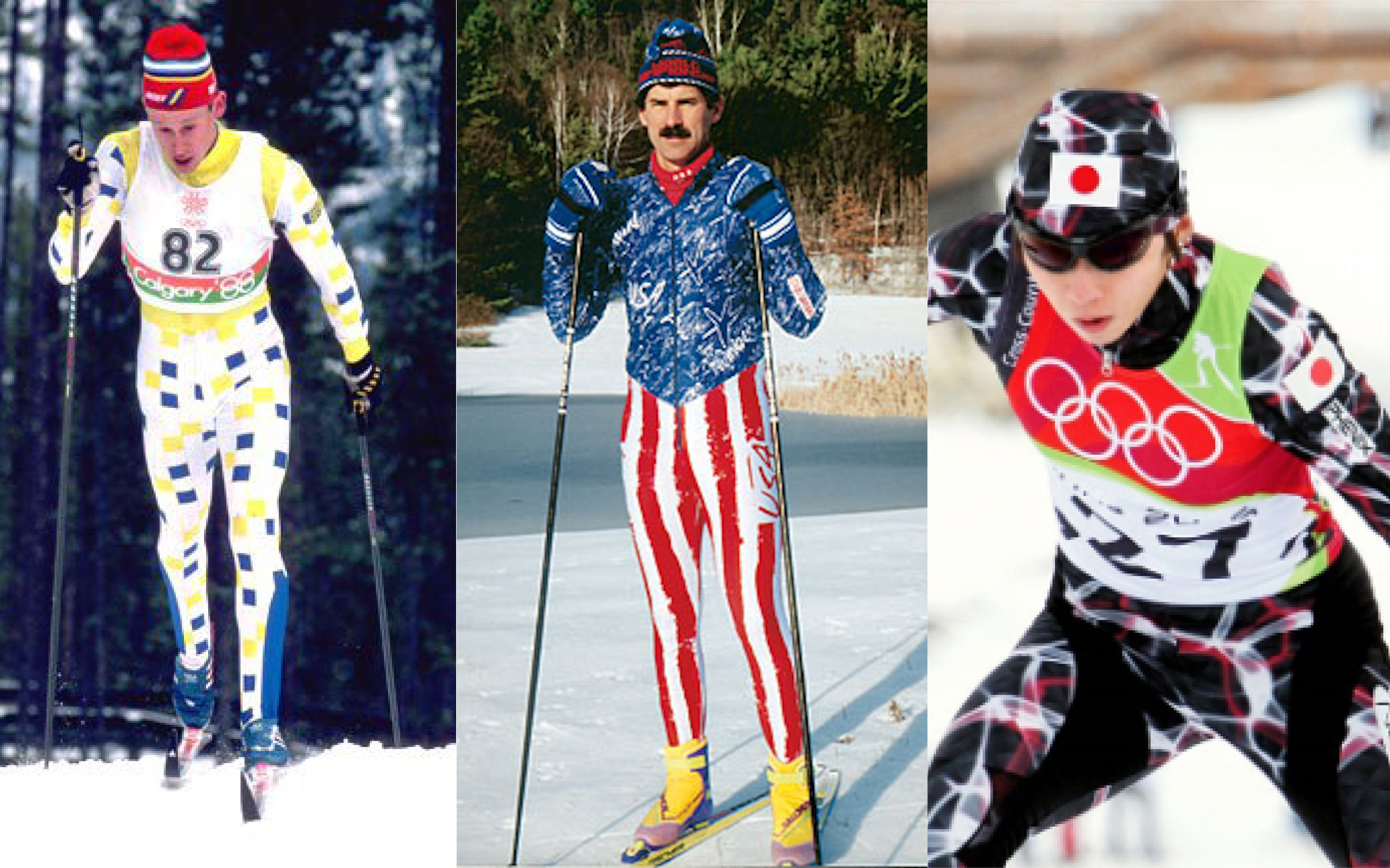
 1. USA 2006 OLYMPICS
This suit is unique. What made it ugly was not its colors or patterns (which are benign) but a special feature, its hood. The hood was added for aerodynamic purposes, which still seems like a good idea in principle. In practice it was hot, claustrophobic, and didn’t significantly reduce drag—which was the only reason for its existence. As unique as the hood was, it did not feature excessive clashing so will score low in Category 1. Other than the hood it was pretty inoffensive, and the U.S. had some excellent races at these Olympics so it scores low in Category 2 and high in 3.
Cat. 1: (10/20) Cat. 2. (4/10) 3. Cat 3.: (11/20) Total: (25/50)
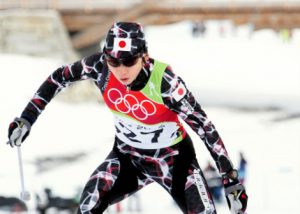 2. JAPAN 2006 OLYMPICS
This suit is really something. It looks like the screensaver on an old Macintosh, or perhaps a marble countertop. Unfortunately, 2006 was not a standout year for ugly suits, and a big reason is that it was an Olympic year. To avoid issues with sponsor logos most countries design completely new suits for the Olympics, which seems to me like an incredibly high-risk/high-reward thing to do before the most visible event in cross-country skiing. No one from Japan won a medal in this suit (which isn’t a big deal since medals are so rare), but no one in this suit came close to the best-ever Japanese finish at an Olympics either so it doesn’t score especially high in Category 3.
Cat 1: (16/20) Cat. 2: (3/10) Cat. 3: (8/20) Total: (27/50)
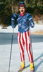 3. USA 1992 OLYMPICS
We, as a country have a great many things to be proud of: That an American biathlete (Vermont’s own John Morton, no less) once wore this suit is not one of them. I wasn’t alive at this point in time, but I have to assume someone phoned Richard Simmons and asked “Hey Richard, What do you think Uncle Sam would do Pilates in?” and he sent them a sketch of this suit. The stripes and scribbles clash beautifully, so it scores high in Category 1. But with 1992 being an Olympic year it did not seem as outlandish compared to its fellow 1992 suits as it does to our 21st century eyeballs.
Cat 1: (18/20). Cat. 2: (5/10) Cat 3: (10/20) Total: (33/50)
4. GERMANY 2016/17
The Germans generally do a great job of recognizing national colors and framing body lines with  consistent patterns. However, this suit, does not do those things. It takes the black, red, and yellow of Germany’s flag too far into the neon zone—which is regrettable, but is also understandable given the current fashion trends. The main problem here is the yellow polka dot matrix across the lower body, which creates odd shading around the inseam and, more problematic, looks like someone threw up all over their legs. It wasn’t the only suit to use this template last year so it doesn’t score well in Category 1. However, Germans have kicked ass in this suit, and it’s hard to deny that it should score high in Category 3.
Cat. 1: (16/20) Cat. 2:: (3/10) Cat. 3: (15/20) Total: (34/50)
5. SWEDEN 1998 OLYMPICS
This suit is wonderful. It has a large amount of white space, which is a dangerous gamble with 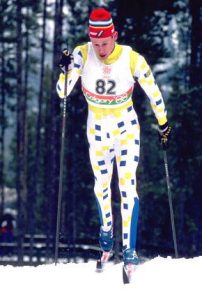 spandex, but its arms and legs are also covered with a blue/yellow checkered pattern that poses quite a few questions. Is this supposed to represent the Swedish flag? Is it some type of secret Scandinavian code? Did the athletes use it to play checkers when they weren’t wearing it? Regardless, its pattern scores well in Category 1. At the 1988 Olympics many suits used color blocking (i.e. all red legs, all white chest, all blue arms) so this suit was unique among its contemporaries and gets points in Category 2. As for Category 3, Olympic four-time gold medalist Gunde Svan wore this suit—enough said.
Cat. 1: (14/20) Cat. 2: (7/10). Cat. 3: (18/20) 4. Total: (39/50)
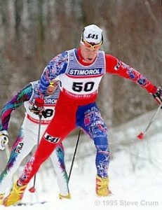 6. NORWAY 1994/95
This suit is the pinnacle of ugly suits. The Nordic Runes seem to have no rhyme or reason—but not in a Jackson Pollock sort of way, more in a Pre-K Art sort of way. The color blocking of the suit also gives the whole thing a medieval jester’s vibe. It scores very high in Category 1. Now, as you can see from the second skier in this picture, 1995 was a time of ugly suits, so we can’t score it especially highly in Category 2. This suit however was worn by the second greatest Nordic skier of all time and won a LOT of races, and as such scores well in Category 3.
Cat. 1: (19/20). Cat. 2: (6/10) Cat. 3: (20/20) Total: (45/50)
Patrick Caldwell wears whatever suit the U.S. Cross Country Ski Team tells him to wear. Reprinted with permission from the SMS TT2 blog. Send all future/angry/reactionary nominations to @smst2team on Instagram.
Pingback: Vermont Sports Magazine, Insider's Guide To The 2018 Olympics
Pingback: You Olympic News, All In One Place — VT SKI + RIDE Magazine